Imagine you went shopping in a mall. When you enter a store where there are no proper salesmen to greet you, you have to wait or travel from one corner to another just to get the information about the product and it’s very hard to find the product that you are looking for since it’s not well managed, what would you do?
You don’t feel good, maybe confused? Might not buy much and never enter the store again.
In the next scenario, when you’re in a clean store. Where there is the right amount of information which you can access easily. It’s really easy to find more info about the product since the salesmen are nearby. And if you feel good being there, you’ll usually end up buying more than you initially intended.
Now analyse, which category does your online store fit in? First or the second?
Your website is the online version of a physical store. When online store owners are focusing on the traffic source, launching new products and creatives, they usually forget about another very important section. That is the conversion rate of the store.
We understand how conversion rate optimization can be difficult and confusing for people without technical knowledge, that’s why we have built a document with the best practices which will dramatically enhance the purchase ratio when people enter your website.
This document consists of many landing page changes you can implement and the tips which we developed after spending Million of dollars in testing. In short, this is the shortcut to your marketing campaign.
So, grab your diary to take notes, implement the tips and see your store convert people.
2. The basics - add trust
When it comes to website optimization (for conversions) of a particular business there are three things that we need to keep in mind – Aesthetics, symmetry and consistency, Ease of use and eliminating hesitations. Here we will break down each of these and what we are looking for.
Aesthetics, symmetry and consistency Aesthetics and symmetry play an integral part in determining whether something looks good or not. We are going to look for these in every aspect of the website. One example is product images. It is important that the images on a website are the same size and ideally be on the same/similar background. In addition, on the product page there should be some form of a system or order in which the products are displayed.
Ease of use The user experience is one of the pillars on which many businesses are built on (ex. Apple and Amazon). To test the ease of use try going through the process of looking through the website like you are interested in buying a particular product. See if the website is designed in a way that it makes it easier for you to find what you are looking for or whether there are additional steps that make the purchasing process extra long. Make sure you test both mobile and desktop versions of the website and landing pages. On mobile it’s very important to have key information visible straight away – product image (on a clear/white background to eliminate distractions), sizes, availability etc. Also, make sure the header title is strong and clear and the add to cart button is colour filled!
Eliminating hesitations Hesitation is a very common feeling among people especially when it comes to making buying decisions. To make a decision to purchase something people want to know that their payment info isn’t going to leak or be used so look for secure payment logos. Another thing they look for is social proof, they want to know that other people have bought a product before and if they had issues with shipping or quality for example. Customer reviews do a great job in reducing hesitation as people will feel more comfortable with the brand/business. Also make sure that you have your contact details included and people can get in touch if needed. In regards to clothing and jewelry sizing is also a very common hesitation so make sure you have appropriate sizing tables (maybe include the size of the model as well).
Key Takeaway points
Symmetrical product images – similar background, identical size etc.
Displaying the product in a similar fashion on the product page. For example – front of product, back of product, someone wearing product.
Make sure the first image on the product page is just the product with no background distractions!
Separating clearly collections by gender, type of product etc.
Add to cart button to be colour filled.
Include customer reviews – ideally product specific and a separate page on the website for overall experience.
Secure payment logos
Appropriate size guides
3. Short term
1. Collapse emails pop-ups rather than close them.
Email pop-ups are automatically closed a lot of the time and sometimes people regret it. They cannot bring them back to exchange their email for a particular benefit so a simple solution is to have the pop-up collapse at the bottom of the page so they can bring it back at a later time. (See picture)
2. Use the top promo bar in different ways.
Usually, the top promo bar is used for promoting sales, and for the off-sale period is primarily used for free shipping. Try to stand out and include a very specific unique selling point that would easily grab attention.
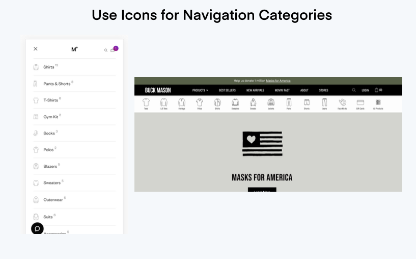
3. Use icons to make it easier for people to navigate through the website
This is not equally important for every niche since some categories are easily described with a world like – hoodies, bottoms, hats etc. Regardless, the user experience can be simplified and made more enjoyable if icons are added next to the words in the category sections.
4. Targeted shipping timing
What better way to stand out than to estimate the time it would take for the product to reach the customer before they have decided to buy. This would preemptively eliminate a common hesitation that many customers have.
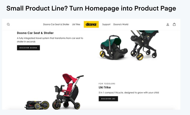
5. Turn your home page into a product page - more practical for small product lines.
If you sell a small number of products you can easily eliminate an extra step and turn your homepage into a product page. This way your customers get to see what they are looking for straight away and are already put in the mindset of buying!
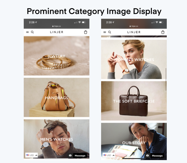
6. Category image display on mobile
Instead of distracting your potential mobile users with additional steps on the homepage, consider having the first page to be product categories with relevant images. This way they can go straight into what they are looking for!
7. Mini Navigation with icons
This tip is kind of similar to the previous one but you get to keep the brand focused images on your home page. If you have a bar with the categories on top, accompanied with relevant images your mobile users will find it easier to locate the category they are looking for!
8. Alternative way to present product reviews
When looking at reviews, people usually look at products that have a lot of reviews and then they check how many of them are actually five star ones. So in order to make it easier for your customer to evaluate the product you can show the number of 5 star reviews for a specific product rather than showing the total number of reviews. This way it saves them the time to click on the reviews and check the numbers themselves.
9. Product inventory information to create urgency.
For your best sellers, consider adding a message that warns people about your current inventory. People will be more likely to purchase something that may go out of stock, so they don’t have to wait for the restock!
10. Shipping origin information
Providing clear information about shipping is just another way to reduce customer hesitation. If you display the location of which a product will be shipping, your customers will get a better idea as to when it will arrive.
11. Display the number of carts a product is in.
Another way to create a scarcity factor or showcase the popularity of a product is to display the number of carts a particular product is in. This is a good sales technique and also can be seen as eliminating a hesitation of whether the product is actually popular.
12. Don’t show out of stock variants by default
When driving people to your product page make sure the default variant is never out of stock. If people are directly hit with a “out of stock” message it might discourage them and you could potentially lose the sale.
4. Mid term
1. Bucket Users By Gender
It can be easy to mix up messaging and imagery on the site if you’re selling to both genders. Most of the time, we tend to put focus on one vs the other which leads to lower conversion rates.
2. Personalised Landing Pages From Influencers.
If you’re running an influencer campaign, the handoff from the influencer to your website is critical. Chances are that users are more likely to purchase based on affinity to influencers vs your brand alone. Use this opportunity to personalise at least the landing page the influencer is driving the user to. You can use Google Optimise + Query parameter targeting to change up the content vs building fully custom pages for every influencer.
3. Floating Mobile Menu On the Bottom Of the Screen
It might seem counterintuitive, but this is arguably the most efficient way to keep your floating mobile menu. In this example, the menu is placed on the bottom of the screen. If you actually try it, you’ll see that it’s actually a more natural placement for thumb interaction. The “why” behind this is not data-driven but an outside-the-box UX idea.
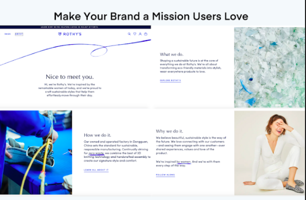
4. Make Your Brand a Mission Users Love
Have you ever found a commercial so intriguing that it made you feel a bit different about that brand? Well, Brand affinity is real! How inspirational is your story? Do you have a mission that customers can latch on and relate to?
5. Welcome Model – Offer Down Sell to Existing Subscribers
The frustration is real when a website doesn’t remember that you’ve already subscribed. This means that you need to sign up, open your email, and enter the code ALL. OVER. AGAIN. This makes quite a dent in your returning customer base. The solution? Welcome them back. Thank them. If you know something about them like their last name, ask them about it. At the minimum, give them something. Maybe it’s that 10% off their next purchase. Let’s be real – if you’re blanket giving away 10% off to any new user, do you really care if a returning customer gets 10% off to purchase a second item? That’s how you keep a customer coming back!
6. Offer Text Message Support
For any business, communication with your potential customers should be at the top of your priority list.
How many times have you had a question about a product, shipping, or something else but couldn’t get through to the vendor?
And let’s be honest, how many potential customers will send an email anyway?
Text messaging is one of the most common ways of communication and the open rates of SMS vs email are significantly higher. (some data show 90+% open rates for SMS)
Meet your customer where they are – offer SMS for support questions and a link back to the product they were reviewing.
7. Simple Auto-Scroll Gesture for Hidden Content
You might be hiding a lot of content on mobile carousels and might not know the engagement with them. (How many users are actually scrolling through to view the content?)
Adding simple gestures that show the user potentially hidden content they can interact with can go a long way.
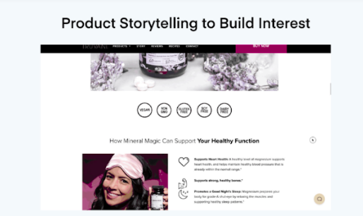
8. Product Storytelling to Build Interest
When was the last time you caught yourself actually reading a landing page without any real imagery?
It’s a rarity, isn’t it?
Adding beautiful images and icons helps to retain a potential customer so that they can actually make a purchase.
9. Stock Frequency Messaging
Do you sell items that go out of stock regularly? Instead of just providing the typical “low inventory” status message, consider an alternative such as “Expected to sell out within 3 days.”
This sets expectations and offers a better buying experience.
10. Ultimate product Bundle Decision
Have you ever purchased something and when it arrived, you immediately realized you were missing another product to get the full use from the original product?
Give the user the option while adding to cart + a confidence boost on how often they are purchased together.
11. Interactive Size Guide
When you have a high percentage of returns due to sizing issues, consider a unique “Find Your Fit” experience to help customers discover the best size for them.
12. Expand Cart for Abandoned Carts
This is another idea to target the revisitors.
A subtle reminder that they have added to the cart can be a way to set expectations when they return to the site.
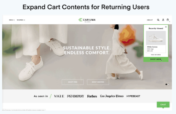
13. Expand Cart Contents for Returning Users
A reminder of what the user recently viewed can be a way to set expectations when they return to the site. This could be incredibly useful if you see a large number of visits before a user completes a purchase. Or they might be returning to “triple-check” the product they want so bad. Don’t make them search for it. Get them there ASAP!
14. Order Bump at Checkout
The classic grocery store upsell. Candy bars, drinks, gum, and other titbits. If you’re on Shopify Plus, consider a simple cross-sell via the Order Bump app that allows you to mix and match cross-sells to different products.
This is especially important when you’re heavily discounting.
15. Mystery Gift Upsell
Lift your average order value while discounting. Make things fun. Create a mystery product to entice users with a bit of curiosity.
5. Long term
1. Anchor Similar Products To Push AOV
To increase or promote your higher-priced product, sometimes positioning plays a vital role. Instead of positioning your product evenly in a product grid, try anchoring the products to one another. Then call out the selling points of the product that are more likely to resonate with customers.
2. Creating a Quiz? Make It About Them, Not You
Quizzes are amazing and most of the time, they work. Which do you prefer more? A quiz asking about the specifics of a product OR a quiz that builds a “type” profile for you? A “type” quiz is much more fun! Consider a quiz using everyday aspects of life that you can turn into a product recommendation. Make it fun!
3. Offer Test Message Sales Consultation
In the age of chatbots, your brand can do incredible, if you provide a human-to-human connection. It offers them a personalized consultation of their products that adds to the personal touch!
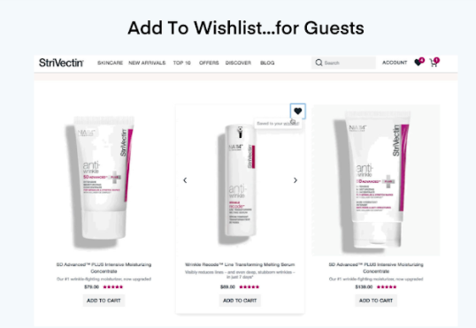
4. Add To Wishlist… for Guests
Forcing your users to create an account to add a product to a wishlist can help in email collection. But how much value are you providing with it? Consider allowing a user to create a wishlist as a guest so they can interact without the abrupt disruption in account creation. Then allow the account creation to happen in a more user-friendly manner.
5. Display Items Already Added To Cart
If your average number of unique products per transaction is more than 2-3 items, consider this to remind them what they already have in their cart. This could be good during sale periods when a user might purchase sales or new arrival items in bulk.
6. Mix & Match Products
A confused mind is a lost opportunity. If you sell products that naturally fit together but don’t offer an easy way to order them, you could be losing out on larger revenue. The easiest way is to show a related product grid on the product page. One step up from here is allowing the user to add these items to the cart. In summary, allow users to mix and match to build their outfit.
7. Sign Up For Low Stock
As eCommerce shopping activities increase, so does “window shopping” and price comparison. If you sell goods that users might not want immediately, like toilet paper, this is a really great tool to let your customers know when these products are limited on stock!